Data visualization allows making data and information which seem at first extremely complex, accessible to all.
Il s’agit d’une démarche de vulgarisation graphique de données chiffrées.
Stratec a développé cette expertise en interne et a réalisé différents projets de datavisualisation. Dans ce domaine, l’enjeu est de réaliser un schéma clair, pédagogique et beau, qui permette d’appréhender un ensemble de données complexes, denses, fortement interdépendantes, qui peuvent paraître inaccessibles de prime abord.
Big Data
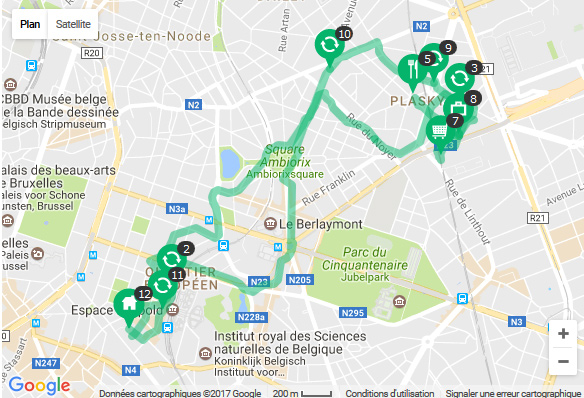
Due to the increasing use of smartphones and mobile apps, the number of connections to the mobile phone masts of the mobile phone operators has become increasingly voluminous (Big data).
The mobile phone data allow to determine the exact time at which the connection was made as well as the exact location of the mobile phone mast to which the mobile phone was connected.
These very rich data source is of great relevance for mobility studies. The sample is huge in terms of representativity and the number of observation per time unit.
Stratec has developed over the years extensive know-how in processing and analyzing these mobile phone data. The successive locations of mobile phone masts to which the users are connected allow to create origin-destination matrices and physical presence rates on different spots with a very sharp spatiotemporal resolution.
We also conduct surveys related to the movement of people by using smartphone apps.
Sankey diagram
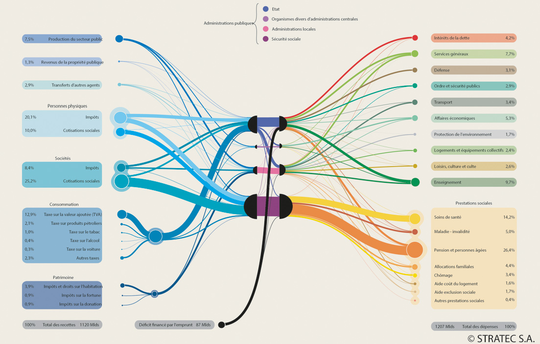
Sankey diagrams allow to represent in a comprehensive way the flows between different entities
These diagrams may concern the flows of materials, financial flow, flows of people, …
The Stratec teams have already developed this kind of diagrams to represent the income and expenses linked to institutions.
Vulgarization
Stratec attaches great importance to the communication with regard to its large-scale infrastructure projects.
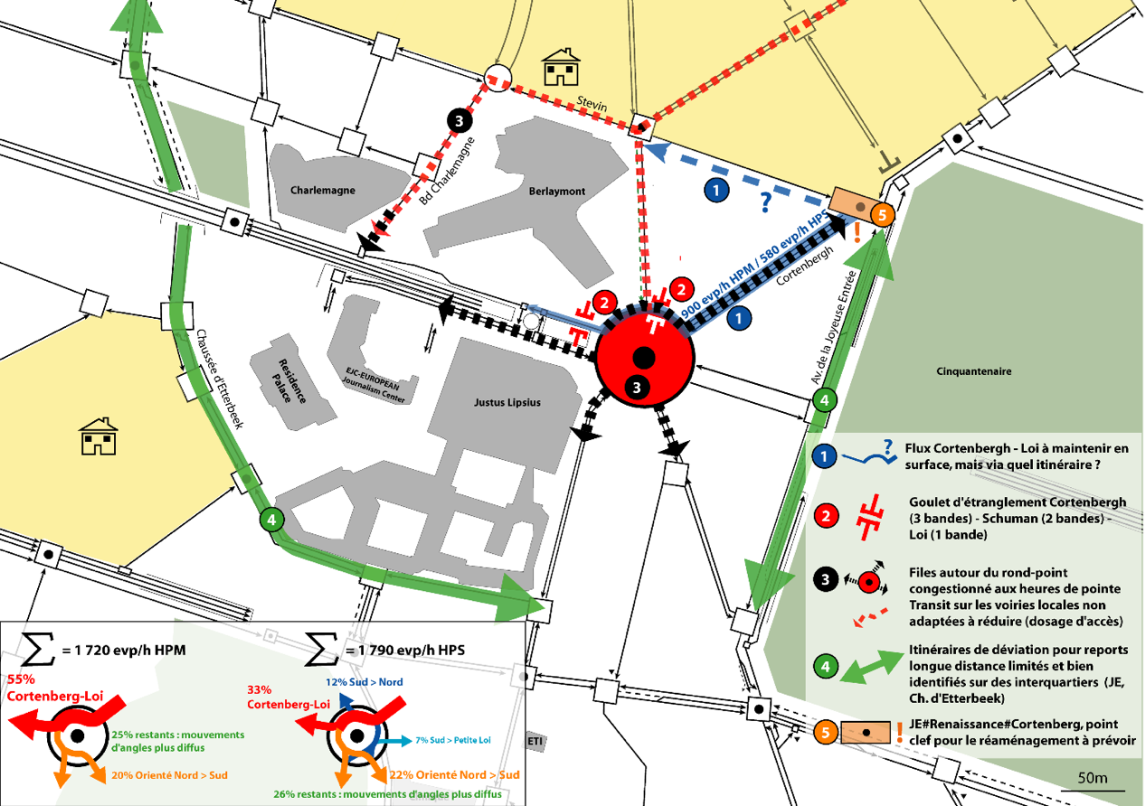
The visuals must be explicit, easy to comprehend and graphical so they can be easily understood and shared by both the authorities and the citizens.
The results of transport flows (of people or freight), the local and territorial challenges of the infrastructure or land use projects, the multimodal accessibility, … To achieve this goal, we use as much as possible visuals and graphs that summarize our studies in a clear and comprehensive way.
Geographic information systems
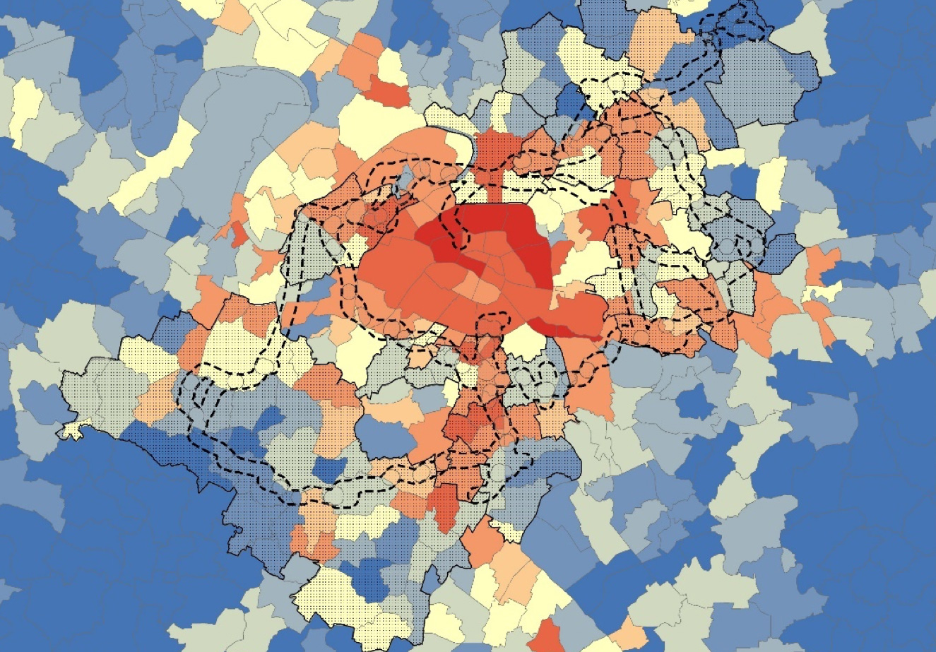
The perfect mastery of Geographic Information Systems (GIS) is another of our various skills.
Most of the data we have to analyze within the scope of our studies, include a geographic dimension. These studies are intended for actors having an in-depth knowledge of their territory.
For this reason, we take great care in providing them with analyses and results under the form of explicit maps so they can use this information as decision-support tools.
Our main tools
- Vectorial design software: Adobe Illustrator
- Geographic information system: ArcGis
- Data processing software: Python, SAS, R
Some key references :
View moreBruxelles Mobilité – AED
2016 - 2016
INFRABEL
2016 - 2016
Exploitation de données « floating mobile data » de l’opérateur Orange
Presentation - FrenchBruxelles Mobilité – AED
2018 - 2019
Appui à la mise à jour du modèle multimodal de déplacement MUSTI
Stratec
2018 - 2018
Exploitation de données “floating car data”


